Blog Design Sprint
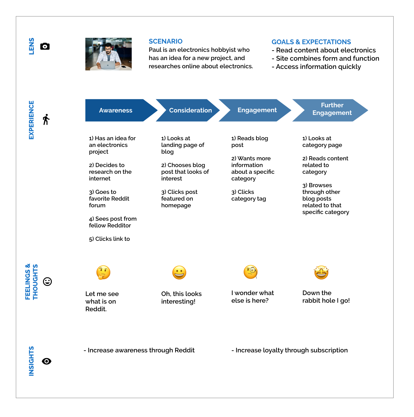
For this team design project, my client was an electronics hobbyist who wanted to create a blog to share his projects and guides with fellow hobbyists in a centralized location.
Role: UX Designer | UX Researcher
Deliverables: User Surveys | Competitor Analysis | Personas | Journey Mapping | User Flow | Storyboard | Sketches | Wireframes | Low-fidelity Prototype
Tools used: Asana | Figma | Google Forms | Optimal Workshop | Zoom
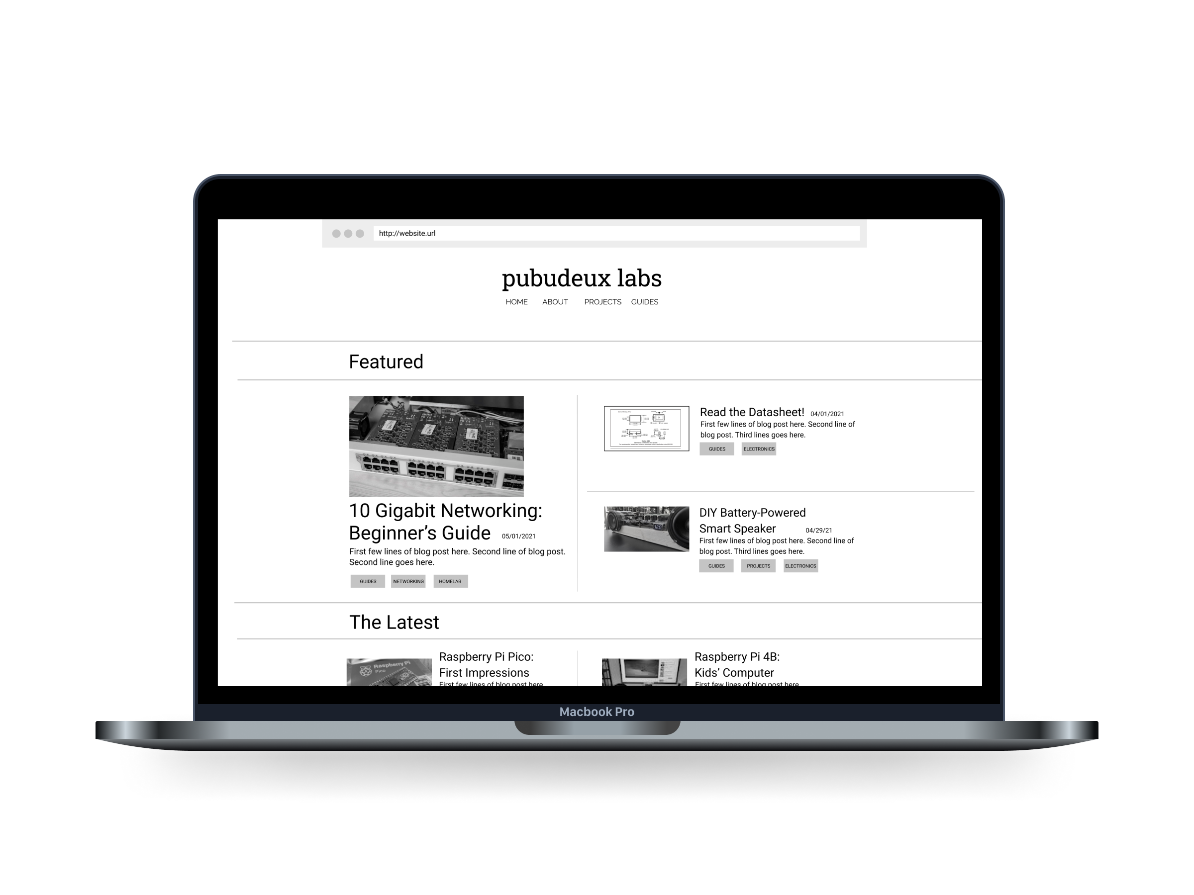
After my client did some initial research on his own, he wanted more of a distinction between pages than what was available as standard blog templates.
The target audience for this blog were adults 18 years of age and older and self-identified electronics hobbyists.
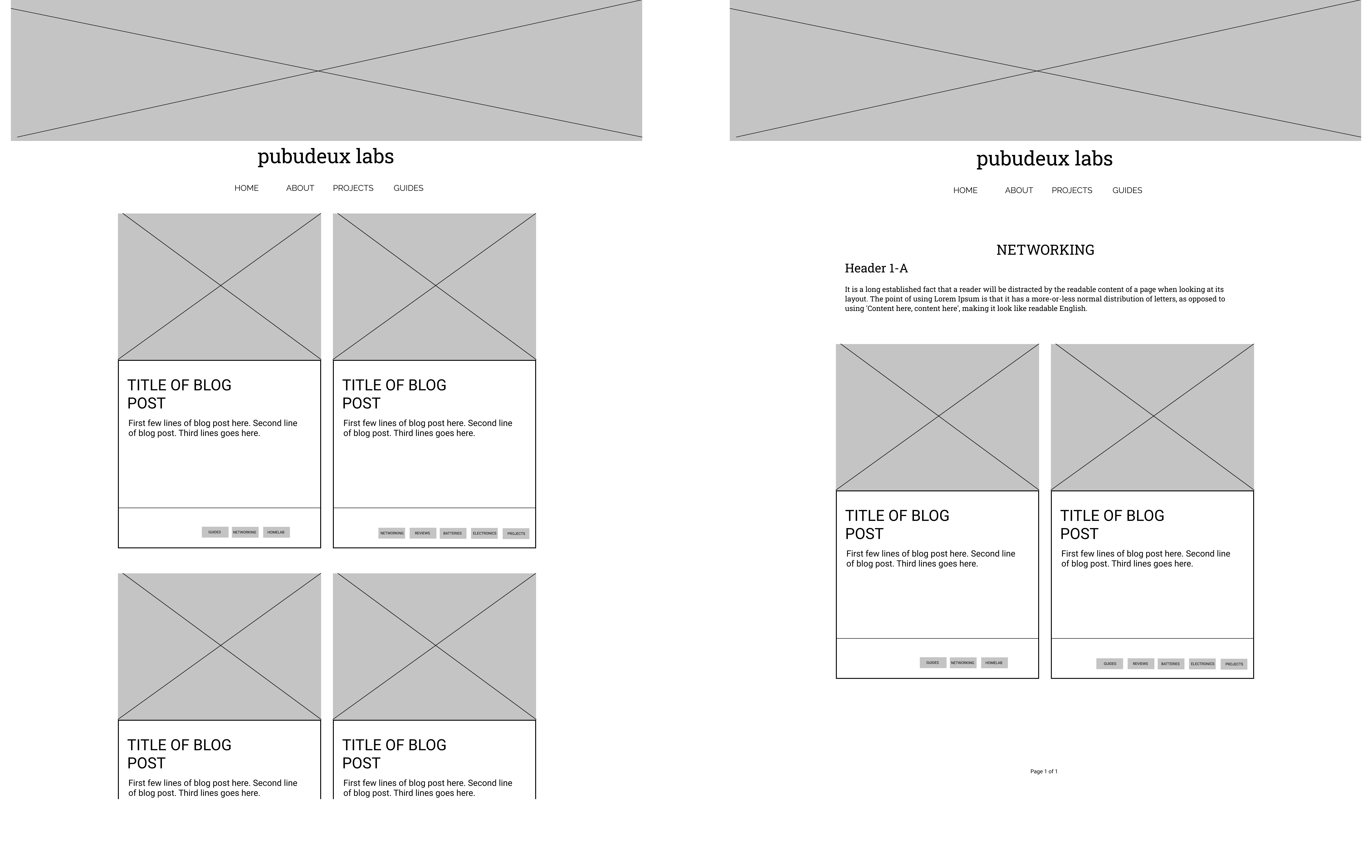
I created a homepage, a blog post page and a categories page all using similar elements in different formats. This helped to create distinction between pages, while maintaining consistency across the blog.
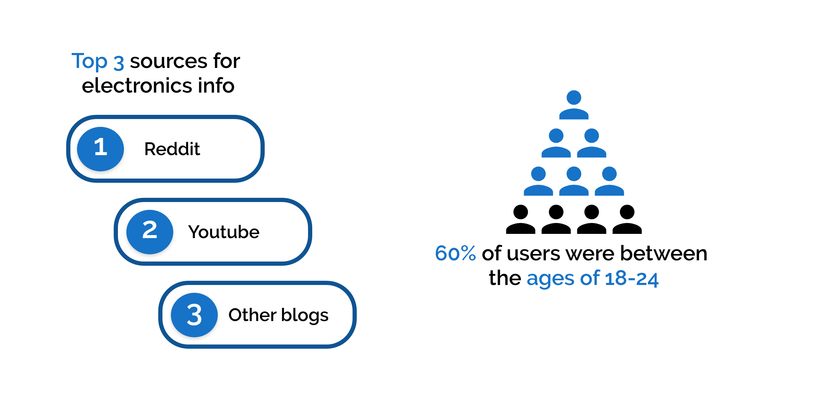
User Surveys
Key Findings
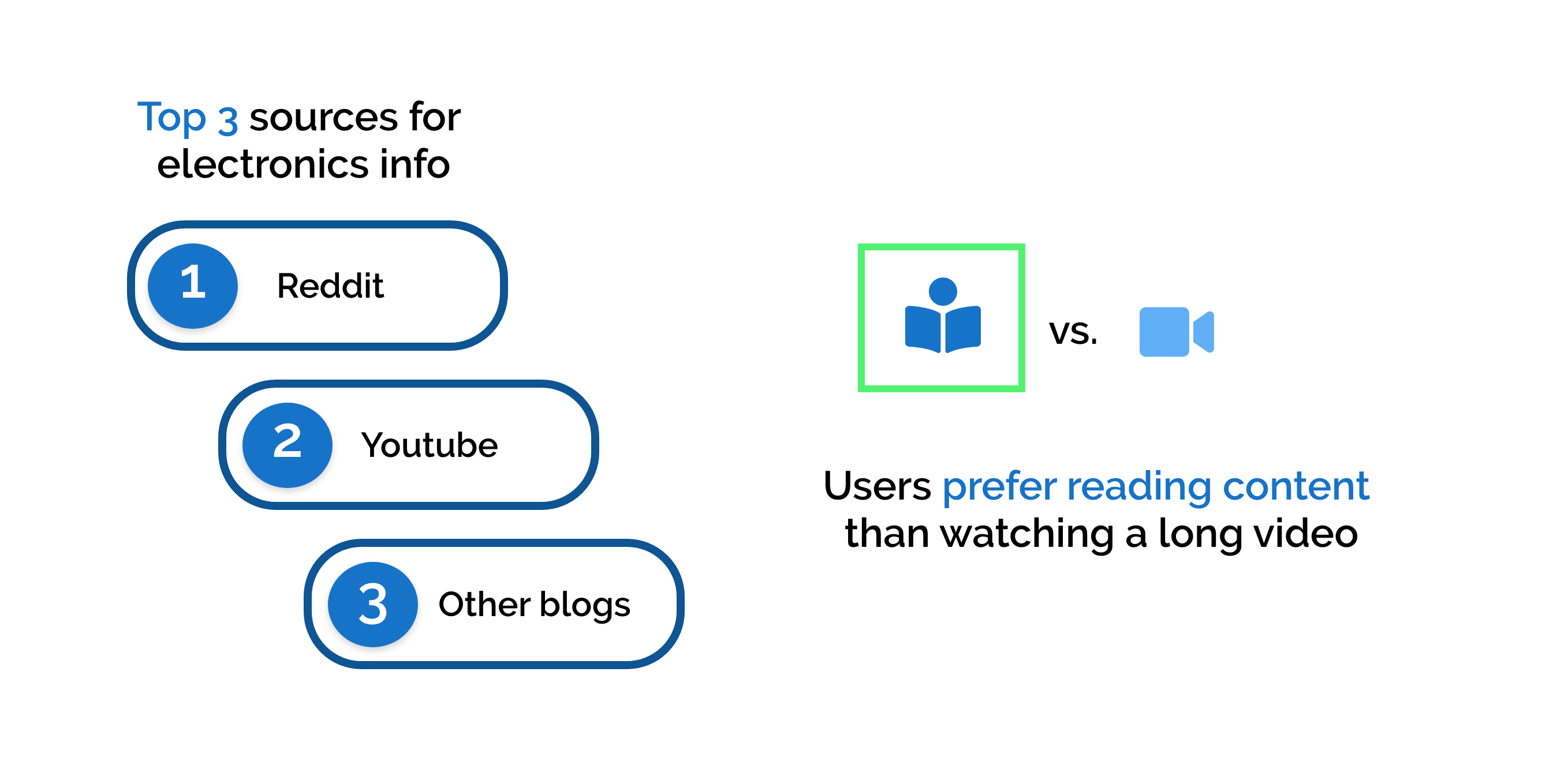
User Interviews
Key Findings
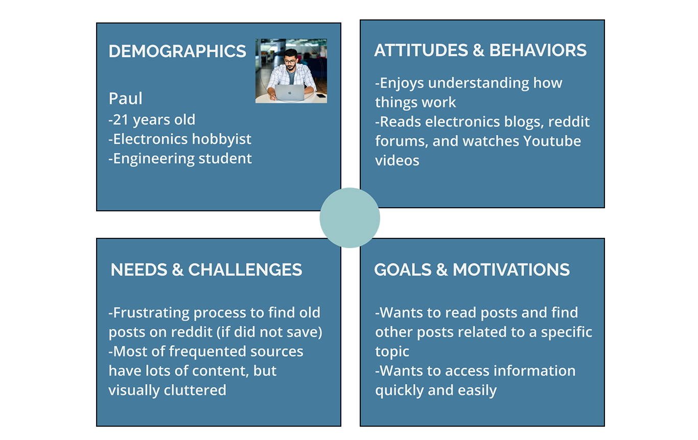
User Stories
These were the top three user stories that I came up with for this project. I ultimately chose to focus on the first two user stories for this design sprint as they aligned most with the client’s proposal.
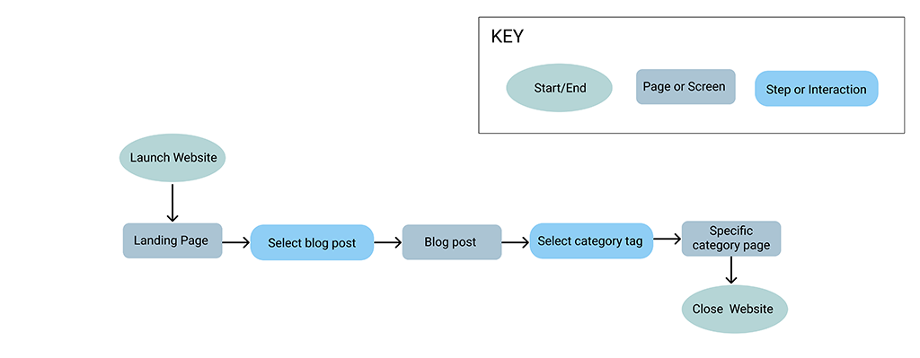
User Flows
Wireframe Sketches

Digital Wireframes
Key Findings
Quotes
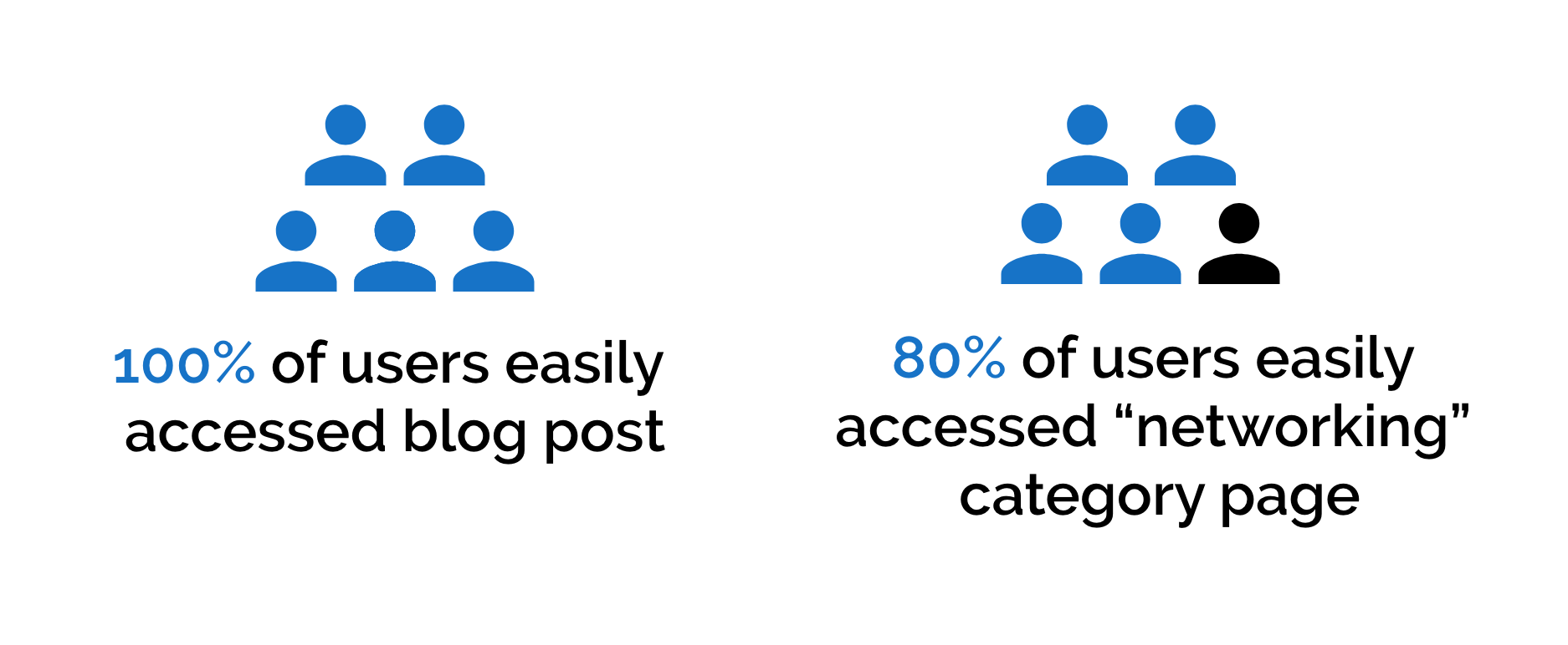
First-Click Testing
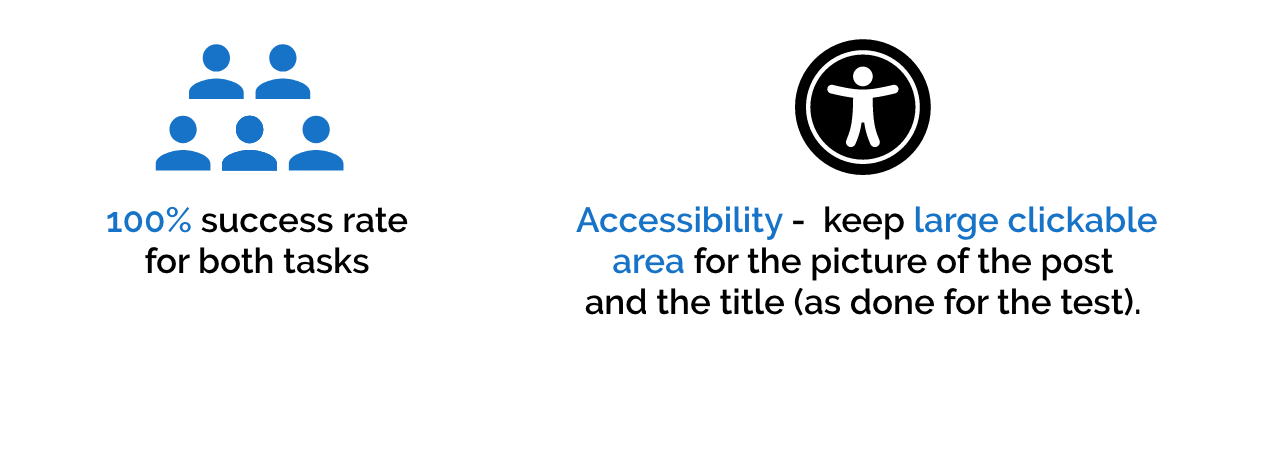
Key Findings
There were 3 main takeaways that I learned through this project: