As a former social worker, something I always struggled with was how to keep track of my Continuing Education Units also commonly referred to as CEUs. As a now UX Designer, I wanted to test my hypothesis and use my new skills to help social workers with this problem, bringing my two worlds together.
Role: UX Designer | UX Researcher
Deliverables: User Survey | Competitor Analysis | Personas | User Flows | Sketches | Wireframes | Mockups | High-fidelity Prototype
Tools Used: Figma | Google Forms | Trello | Zoom
As a licensed social worker, you are required to complete a certain amount of CEU requirements every 2 years. When renewing your license you are asked, if you are randomly selected for an audit, that you have proof that you completed all CEUs. After doing some initial research on my own, I realized that there were no solutions specifically for tracking CEUs for social workers.
The target audience for the mobile application were adults 18 years of age and older and licensed social workers.
I created a mobile application that allowed social workers to track their CEUs and upload their CEU certificates all in one place. I also created a way for social workers to email their recorded CEUs and a section to find a specific state’s licensing requirements.
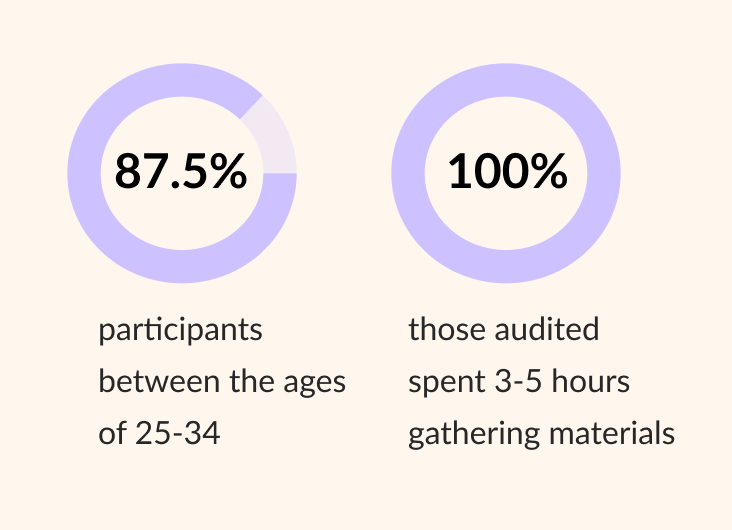
User Surveys
Key Findings
User Interviews
Key Findings
Competitor Analysis
I compared “CE Zoom” and “CE App” for a competitor analysis to understand what competitors are doing well and where there are areas for improvement. Some common themes between the two competitors were that they were not specific for social workers and the visual design could be improved upon. These areas highlighted an opportunity to create a visually dynamic mobile application, and the opportunity to create a mobile app specifically catered to the needs of social workers tracking CEUs. See full analysis below.
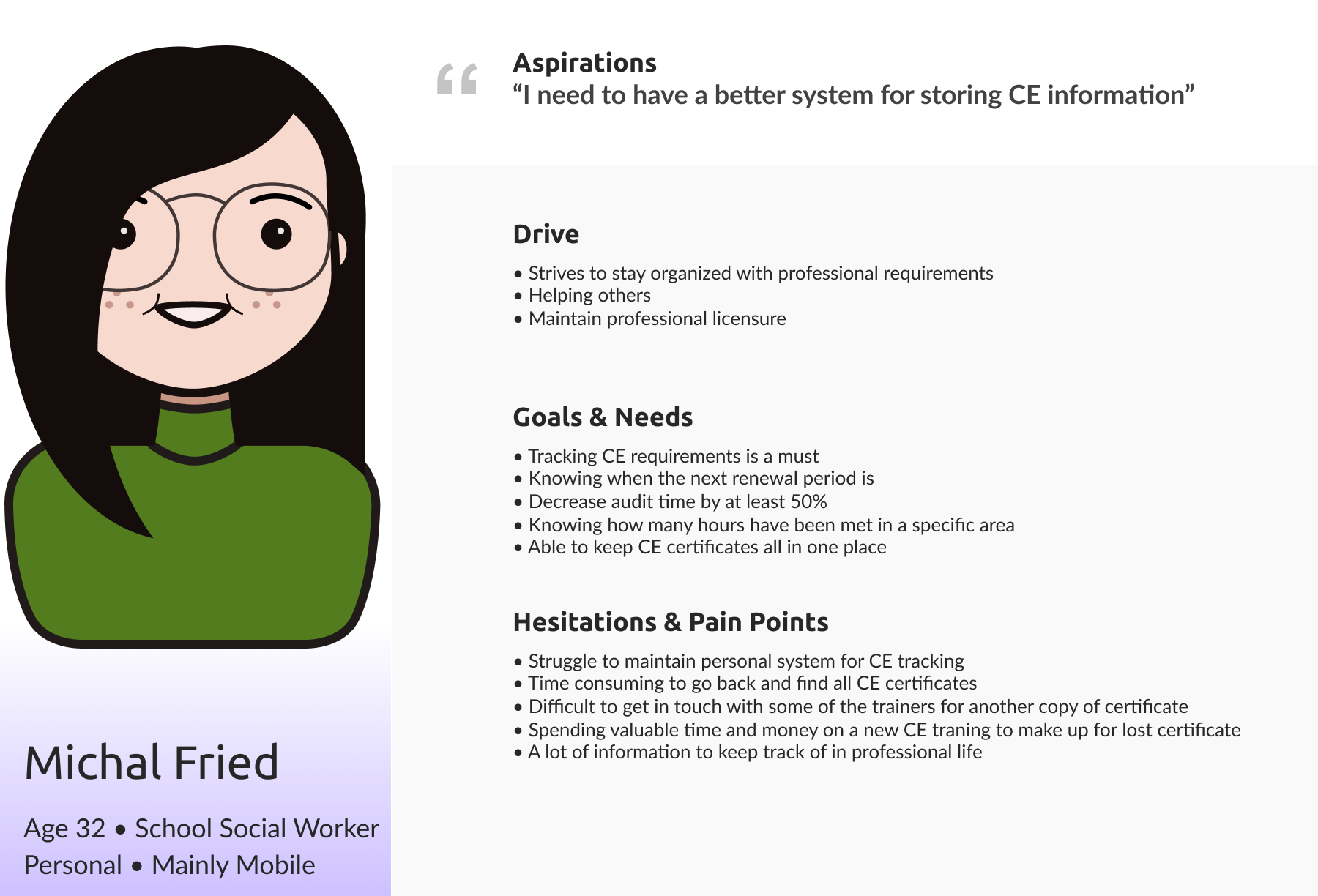
Based on the discovery research, I identified common themes and created a few personas. I chose to follow Michal’s perspective for the user journey as she represented a majority of the themes identified.
User Stories
These were the top four user stories that I came up with for this project. I chose to focus on all four because they all are integral parts that would decrease audit time.
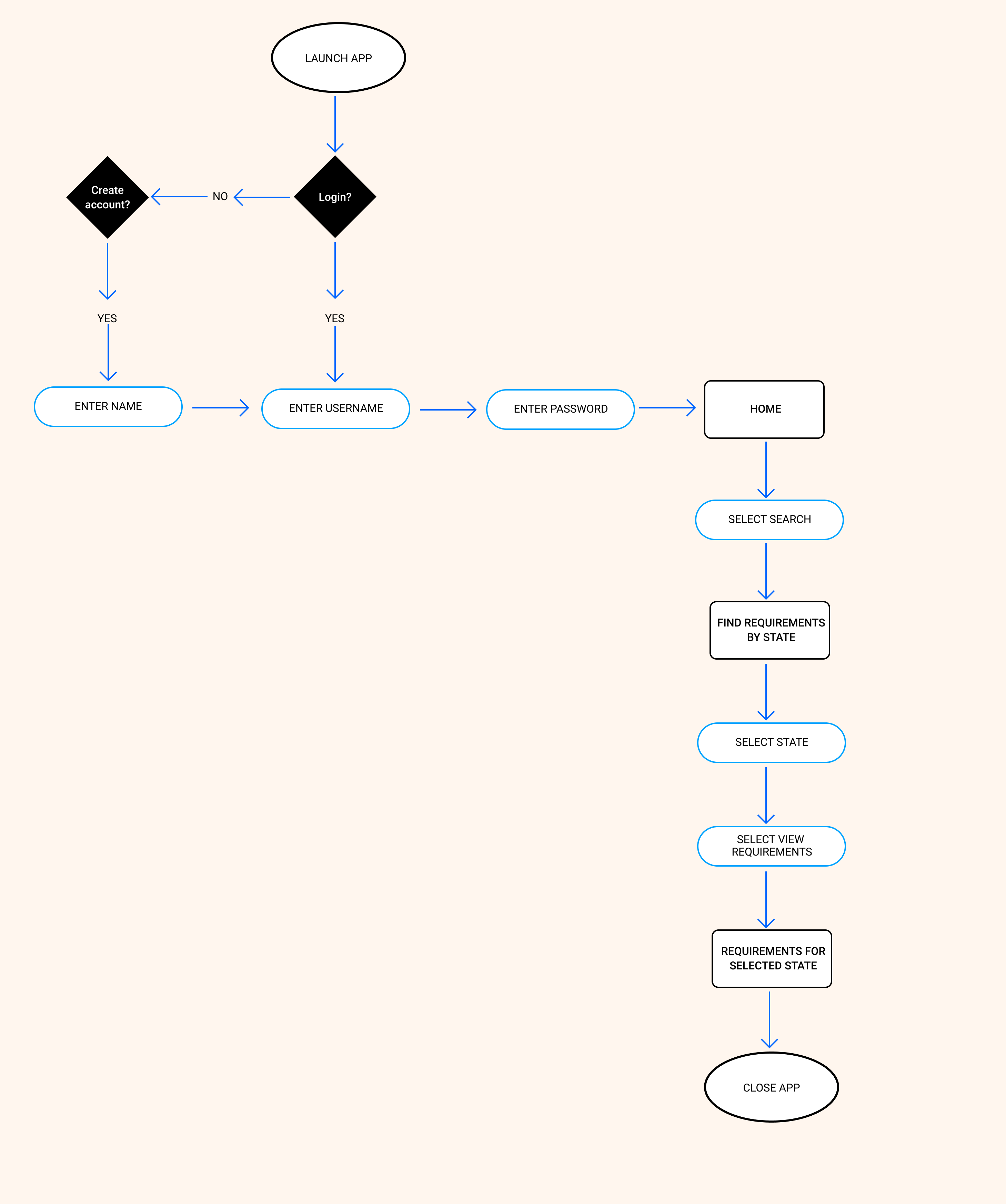
User Flows
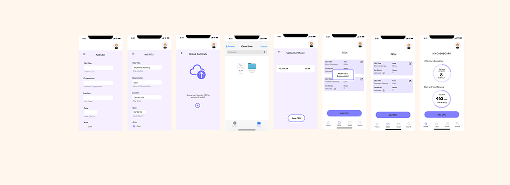
Scenario 1: As a social worker, I want to track my CEU hours and upload my certificate, so that I have all my information in one place.
I ultimately decided to combine these two user stories because it seemed only being able to upload a certificate or only uploading CEU information did not solve the problem of having all the information in one place. So this requires a user to have both pieces of information.
.png)
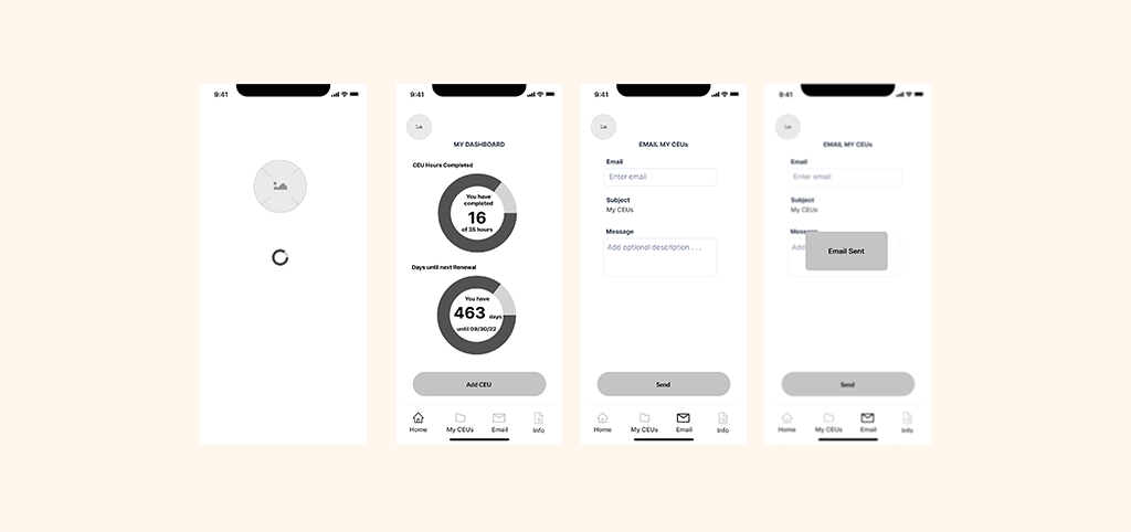
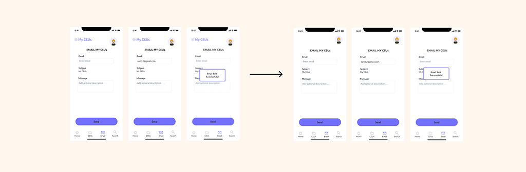
Scenario 2: As a social worker, I want to share my CEU information via email, so that I spend less time filling out the same information in different places.
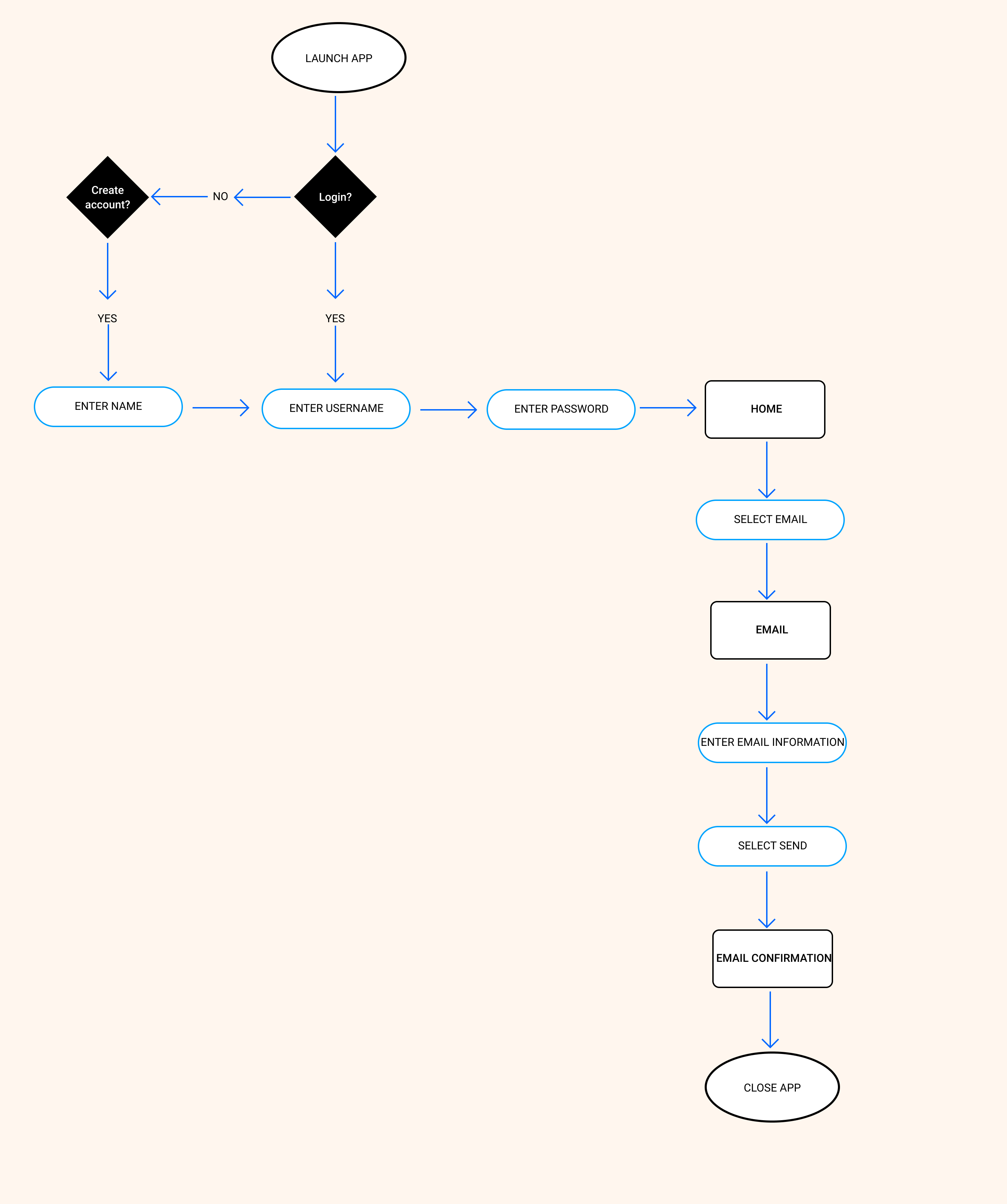
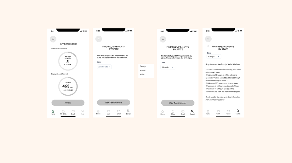
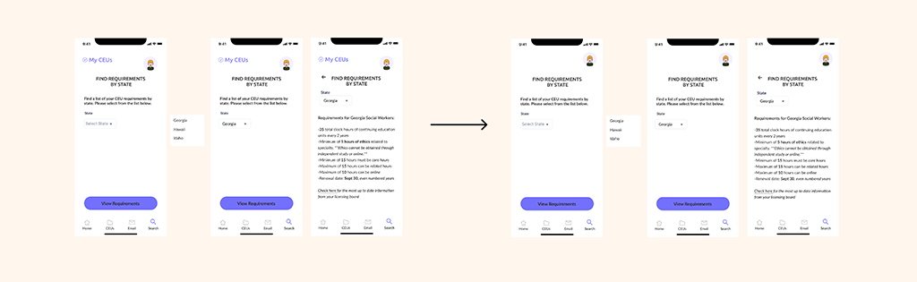
Scenario 3: As a social worker, I want to easily access the CEU requirements for my state, so that I know I am meeting all the requirements for the renewal period.
Wireframe Sketches

Digital Wireframes
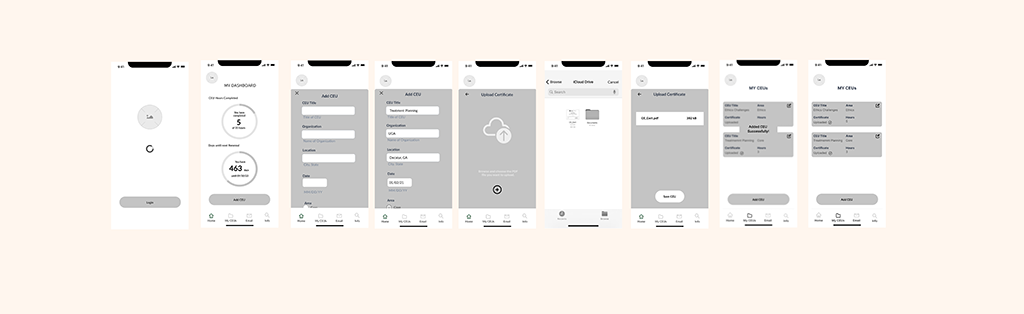
Scenario 1: As a social worker, I want to track my CEU hours and upload my certificate, so that I have all my information in one place.
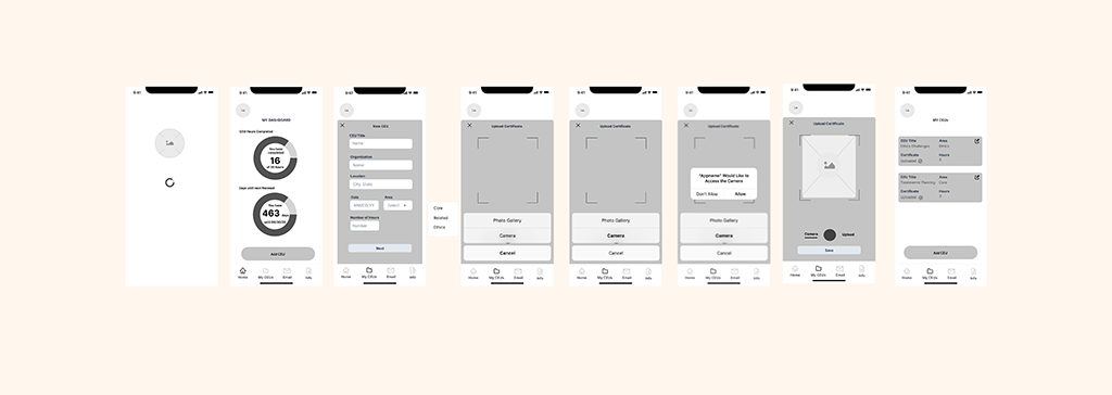
Above is version 1 of my wireframes for uploading CEU information and certificates. The main differences between version 1 and version 2 (see below) are in the “Add CEU” overlay. I changed the layout based on research and best practices. I put all of the questions in one column to help the user with scanning and I changed the “area” criteria from a dropdown menu to radio buttons. I also changed the type of file that could be uploaded to the app. I originally was thinking that someone could take a picture of their CEU certificate and upload it. However, based on industry standards it made more sense to have a PDF file uploaded as this is what would be required if someone was audited by the licensing board. I also added a confirmation alert for when a CEU was added to give the user helpful feedback.
Scenario 2: As a social worker, I want to share my CEU information via email, so that I spend less time filling out the same information in different places.
Scenario 3: As a social worker, I want to easily access the CEU requirements for my state, so that I know I am meeting all the requirements for the renewal period.
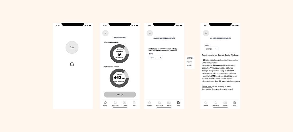
Above is version 1 of my wireframes for looking up licensure requirements by state. After getting some feedback on my wireframes, I changed the icon in the navigation bar from a list to a search icon. I also changed the title of the page from “My Licensure Requirements” to “Find Requirements by State.” I changed the icon, the icon title and the title of the page to align with what the user was intended to do on this page. I also added “Select State” for the dropdown menu title to give more context for the user on what they were selecting from the menu. I then added a “View Requirements” button to give the user more feedback when completing an action and to maintain consistency across the app.
Mockups
Scenario 1: As a social worker, I want to track my CEU hours and upload my certificate, so that I have all my information in one place.
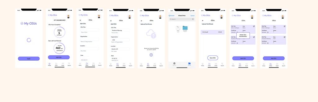
In version 1 of my mockups for scenario 1, some feedback that I received from peers was that it was difficult to see the overlay and it was confusing what page you were on. In version 2 (see below), I changed the background to a lighter purple to distinguish the layer from the main screen. I also added a profile picture in the top right corner to identify that this was a previous user and that they are logged in. I also added an “Updated Homescreen” so that a user could see that their new CEU information counted towards their total number for CEU hours on their dashboard.
Scenario 2: As a social worker, I want to share my CEU information via email, so that I spend less time filling out the same information in different places.
Scenario 3: As a social worker, I want to easily access the CEU requirements for my state, so that I know I am meeting all the requirements for the renewal period.
Mood Board
For the app, I knew that I wanted to create the exact opposite feeling of anxiety and dread for the user. Some words that came to mind were calm, ease, and serene. I also wanted to app to convey reliability. I gathered the pictures for my mood board and I thought about how lavender is a calming scent and the color purple can have that effect as well. Purple also represents peace and justice, which are common themes in social work.

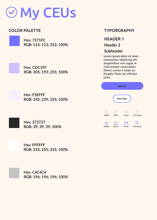
Style Tile
For the color scheme, I chose different shades of purple. The darkest purple I wanted to use for the CTA buttons as this would grab the users attention. As I chose the colors I tested for accessibility by putting different color fonts on the purple backgrounds. While I wanted to have purple be the main color, I wanted it to stand more as an accent to highlight important parts of the app. I decided to keep the design clean and simple with a white background and black text.
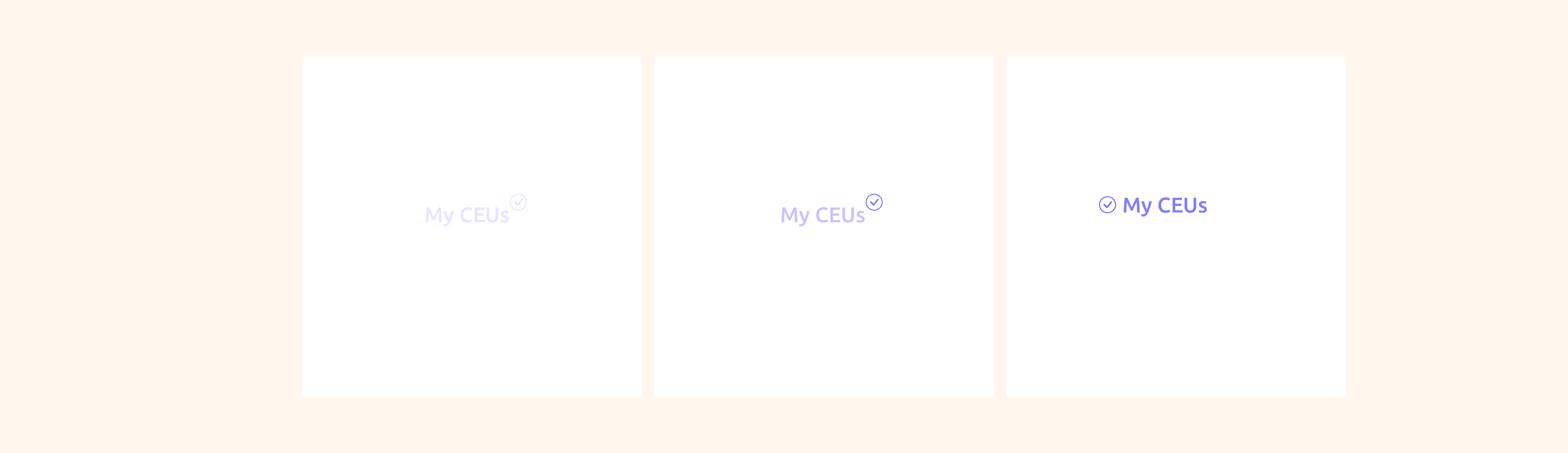
When it came to deciding on a name for the app, the word “my” continued to resonate with me. I thought it would be important that the users feel a sense of ownership when using the app. I jotted down a list of different name ideas and the name “My CEUs” stuck with me. The name was simple and it communicated clearly what the app is for.
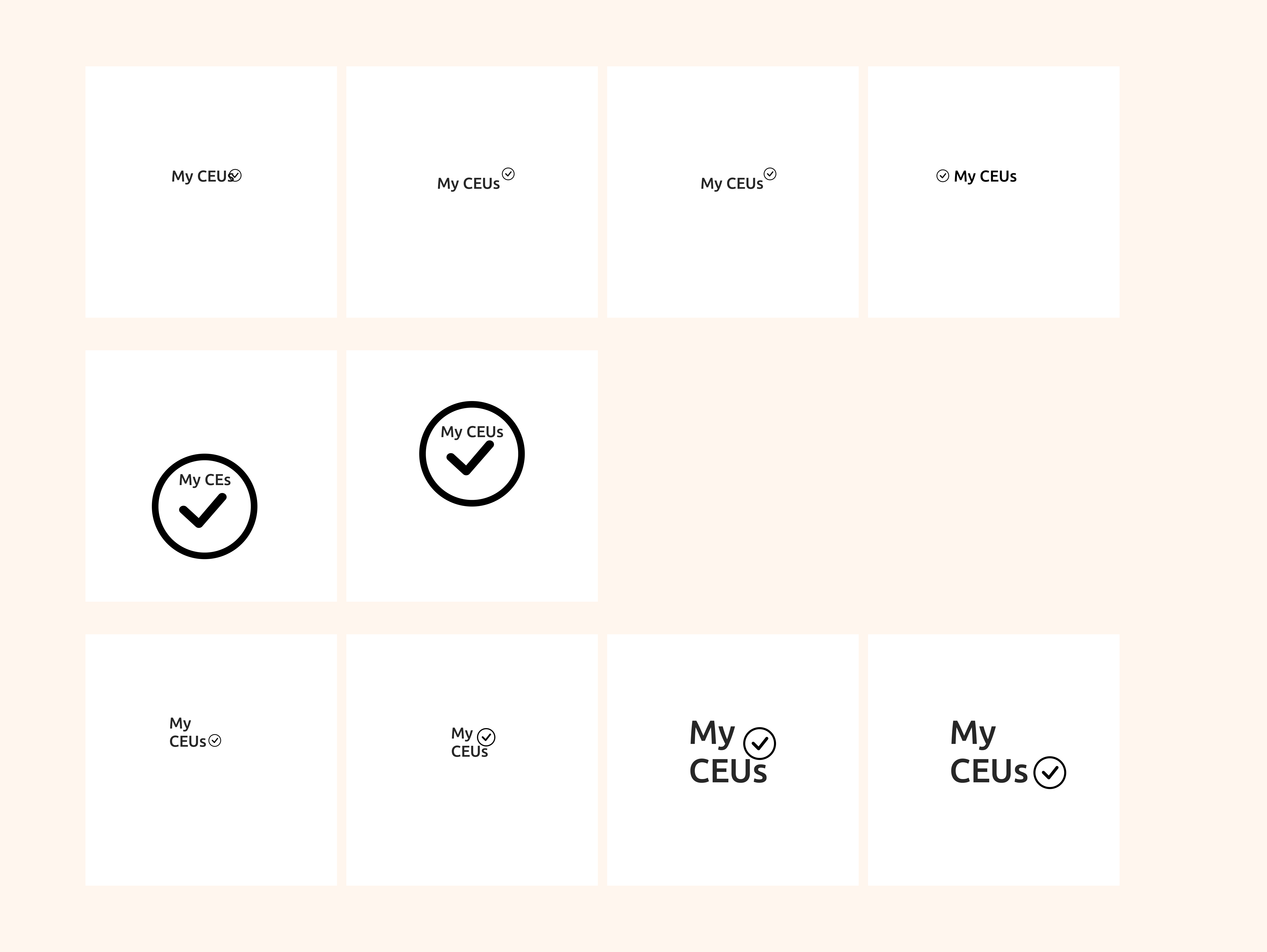
Logo
For the logo, I liked the idea of using a checkmark as it conveys a sense of accomplishment. I also sketched out a few different ideas and showed them to peers to get some feedback. A majority of people liked the top right choice (see below). I then played around with color options, and the darker purple stood out the most.
Key Findings
Quotes
Iterations
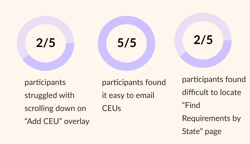
Based on the usability testing, there were 4 changes that I made to the prototype:
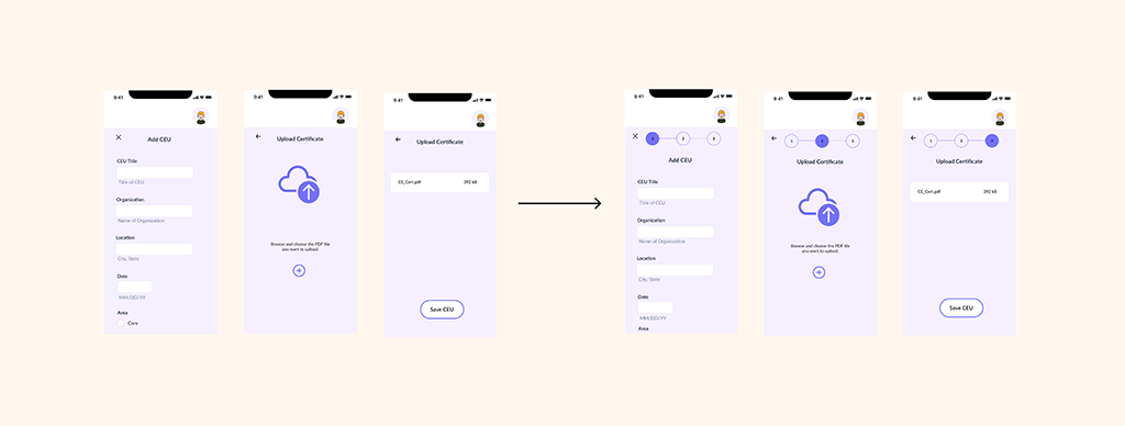
1) I added a progress bar to the “Add CEU” form to give users feedback on where they are in the process of adding a CEU.
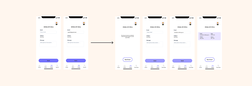
2) I changed the initial page of the “Email” feature. This allows the user to see if they have sent an email with their CEUs previously and a visual to confirm that their email went through.
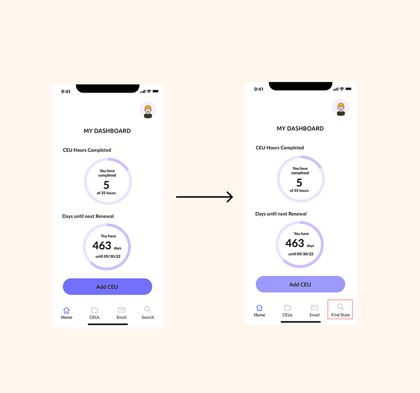
3) I changed the title of the search icon in the navigation bar from “Search” to “Find State.” Ideally, this would make it more clear to the user that this is where they can find licensure requirements for their state.
4) Based on feedback, I changed the background color of the CTA button from 100% to 71%. Even though the button passed for accessibility with the 100% background color, black text on a purple background may be hard to read.
Some things that worked well in this project were the Add CEU and upload a certificate feature, as well as the email feature. Both of these features solved the problem. For something that did not work well, was the “Find my Requirements by State” feature. It was difficult to wordsmith and come up with a new title for the icon in the navigation bar, but I did change it. If I had more time for this project, I would have done another round of usability testing to test this new hypothesis.
The key takeaways for what worked in this project was the idea of having a place to store and share CEU information for social workers is valuable in decreasing audit time. It’s a win for both individuals and the licensing board. If this process is easier, then social workers can spend their time working with their clients. Initially, I doubted whether there was a demand for a mobile application like this. This may be one piece of the puzzle.
As a long term goal, I can see how creating a desktop version for administrators who manage social workers on a larger scale, such as a hospital or community mental health agency, could benefit from knowing where their staff is in terms of completing CEUs. But in the immediate future, I believe doing more usability testing and expanding the app more broadly to states other than Georgia could increase usage.